
Component Guides
These guides cover all the common actions that editors will need to master when working with components. Inserting, editing, moving and deleting components is covered here.
How to insert a component
Components can be inserted on all pages in the designated component zones. The Content Zone features on most pages and is the main zone of the page.
When a zone is empty, it shows in Edit Mode with a checkered background, but once a module is inserted into the zone, the background indication disappears.
You can insert a module in empty zones, or before or after existing modules.
- Go to Edit Mode.
- Click the New Component button in the Sitecore Editor Menu.
- On the page, all available positions for inserting a component are marked with an Add here button. Click the button in the desired position.
- This opens a dialogue window with the component types available for insertion in the specific zone. Select the desired component type and click Select.
The dialogue closes, the component is inserted in the selected position, and you can begin editing the content and the layout. - Remember that your changes are not stored until you click the Save button. If you cancel without saving, the component insertion is cancelled.


How to edit component content
Each component comes with a set of predefined editable properties (also called fields). Simple field types like texts, links and images are editable directly on screen. When in Edit Mode, all editable elements are highlighted with a light blue outline. Note that by default, both fields and components as a whole are highlighted, as both are seen as editable elements. Empty text fields are always visible with a [No text in field] label. This is only visible in Edit Mode, as empty fields are removed from the final page rendering.
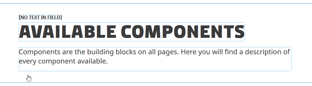
To edit a simple field type like a text, simply click inside the frame of the field and start typing. The field outline will turn dark blue, and a field menu will appear in the top left of the area, showing the name of the field.

Some field types also have one or more buttons available in the field menu with special functionality for the particular field type. In the screenshots above, the Page Title ("Available Components" is a single-line text field with no special buttons. The Page Summary is a Rich Text field, and it has the Pencil icon ("Edit the text"). Clicking this button will open a dialogue window with the Rich Text Editor, offering a wide variety of editing tools for creating rich content like paragraphs, headings, links etc. Image field types have a "Choose an image" button, where you can select an existing image from the Media Library or upload a new one.
In rare cases, components have simple content, which is somehow manipulated in the final module rendering. In Edit Mode only, this content is made visible and editable directly on screen in a dark grey box. The Countdown Banner component is an example of this, where the countdown end date can be set in i single date/time field in Edit Mode, but is split up into days, hours etc. in the final rendering.
How to edit component configuration
Some components have advanced settings that are not reachable from the on-screen editing directly. This could be defining the number of columns or the relevant pages in list components. If a component has any additional configuration options, a button will show in the General Component Menu.
- Go to Edit Mode.
- Click the component to access the General Component Menu.
- If the component has configuration options, a configuration button will show (in this case the Manual List Configuration).
Click the button to open a dialogue window with the configuration options for the component. The options will vary between component types. - Configure the component as desired and click OK.
- Any changes to the Component Configuration will not be applied until you you click the Save button.

How to edit component appearance
Almost all components share the same display options for adding a background color or image. These options apply to the entire frame of the component.
- Go to Edit Mode.
- Click the component to access the General Component Menu.
- In the menu, click the Component Display Options button.
- This opens a dialogue window with the following options:
- Color Scheme: Add a background color to the module. Select between a set of predefined colors.
- Apply Background To Inner Body Only: Select whether the background color should apply to the entire width of the screen or only to the body, giving the component a box-like appearance with spacing to the sides.
- Background Image: Add a background image to the component. This can be combined with a color scheme.
- Background Image Position: Set the positioning of the background image, which can be useful for maintaining a focus point, as the proportions of components vary a lot on different devices (desktop, mobile etc.). By default images are centered horizontally and vertically within the module. Selecting a position forces the image to align differently. For instance, selecting Top Left on a banner image will make the top left corner visible at all times and show as much of the rest as possible within the area available. If selecting Right Center on a watermark image, the image will be placed in the right side of the component and center itself vertically regardless of the height of the component.
- Background Image Behavior: Define the nature of the background image. Cover is used for banner layout, making the image cover the entire width and height, scaling itself to always show as much as possible within the available space. Image cropping will occur. Contain makes sure that the image is visible and fills as much of the background as possible without cropping or distorting the image. Normal (default) is used for watermark layout. It inserts the background image in the actual size with no image manipulation. Cropping can occur when using large images.
- Select your desired settings and click OK.
- Any changes to the Component Display Options will not be applied until you you click the Save button.

How to switch between component variants
Some components have more than one possible variant. While the Component Display Options lets you set general background options, the variants offer different ways of presenting the content of the component. Variants are available on components where the same type of content can be presented in different layouts.
- Go to Edit Mode.
- Click the component to access the General Component Menu.
- If the component supports multiple variants, a Replace with another component button is present in the menu.
Click the button to open a dialogue window with a list of possible variants. - Mark the desired variant and click Select.
The dialogue closes, and the component changes appearance to the selected variant. - Remember that your changes are not stored until you click the Save button.

How to move a component
If you want to change the order in which the components are displayed, you can move a component up or down on the page. Movement is usually restricted to within the current zone.
- Go to Edit Mode.
- Click the component to access the General Component Menu.
- In the menu, click the Move Component button.
- All available positions in the zone are marked with a Move to here button.
Click the button in the desired new position. The order of the components changes. - Remember that your changes are not stored until you click the Save button.


How to delete a component
If a component is unwanted, you can delete it from the specific page. Deleting a component will also delete the corresponding datasource.
Note that deleting a list component won't delete the pages on the list, and any images used by the component will remain in the media library.
- Go to Edit Mode.
- Click the component to access the General Component Menu.
- In the menu, click the Remove Component button.
The component is removed from the page, and the corresponding datasource is deleted. - Remember that your changes are not stored until you click the Save button. If you cancel without saving, the component will still be present on the page.

Related content
-
Page Structure
Read moreEvery page in the solution shares a common structure foundation consisting of a set of zones.
-
Component Fundamentals
Read moreAll component share the same base functionality and display options.
-
Available Components
Read moreComponents are the building blocks on all pages. Here you will find a description of every component available.